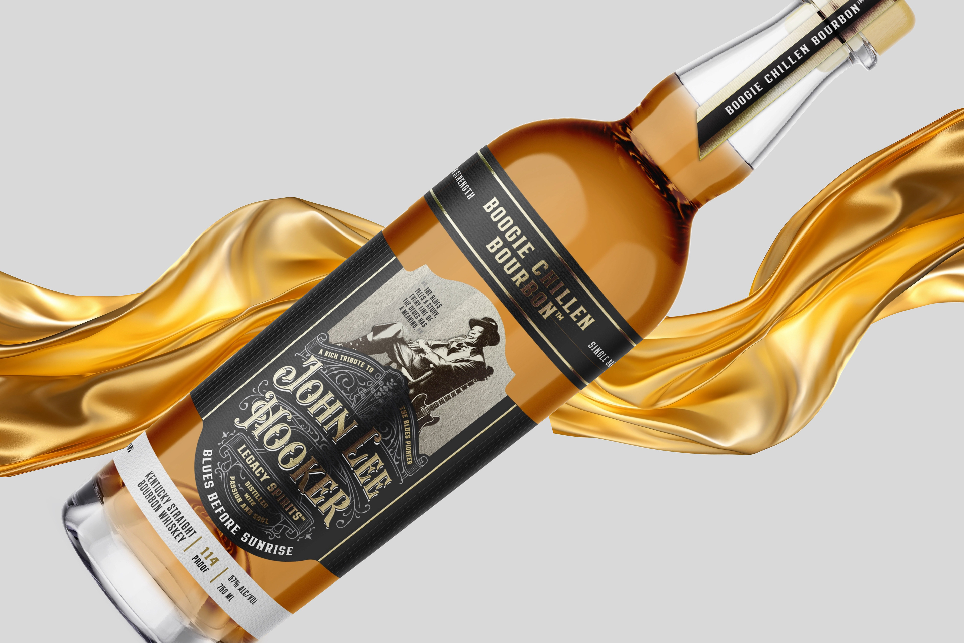
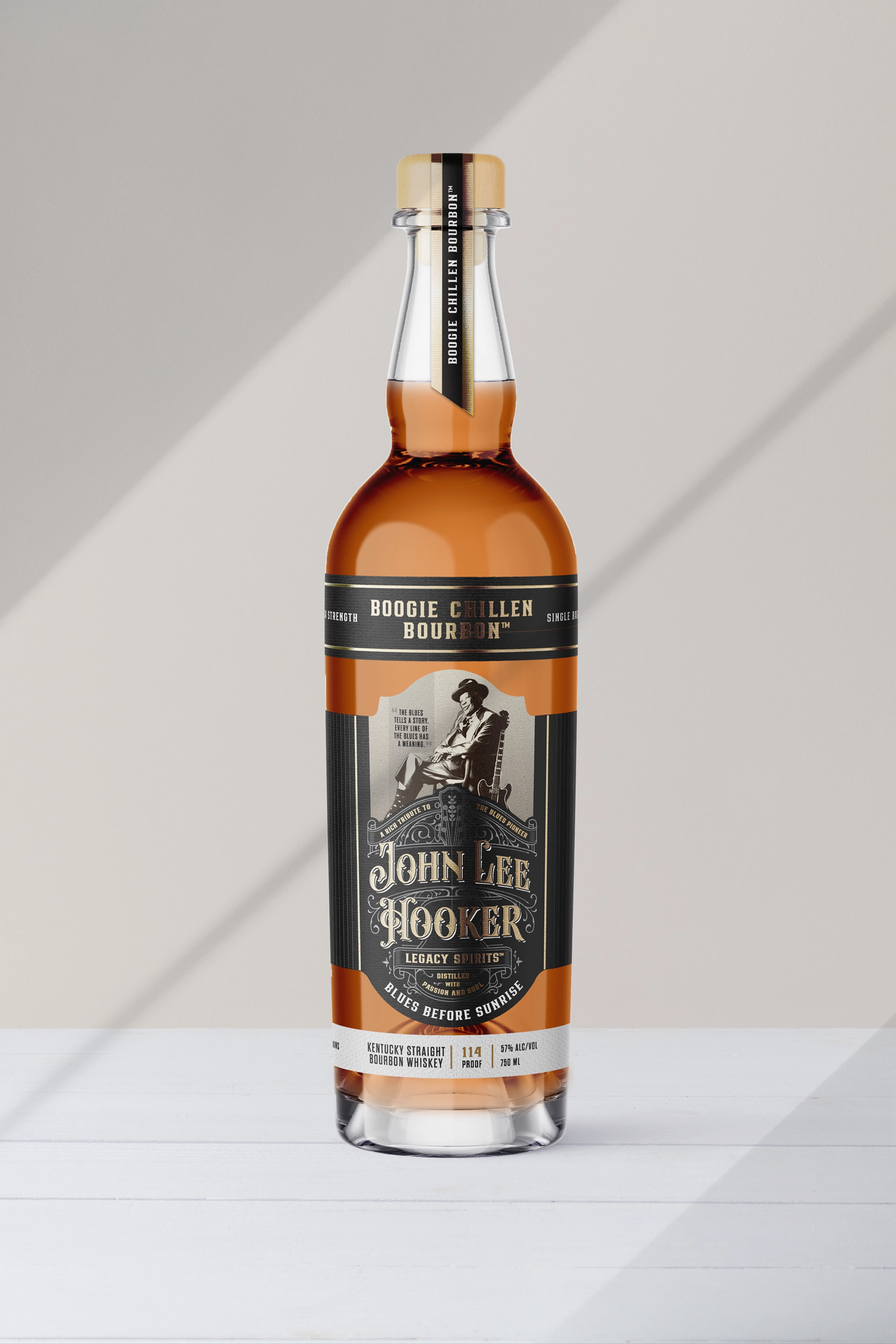
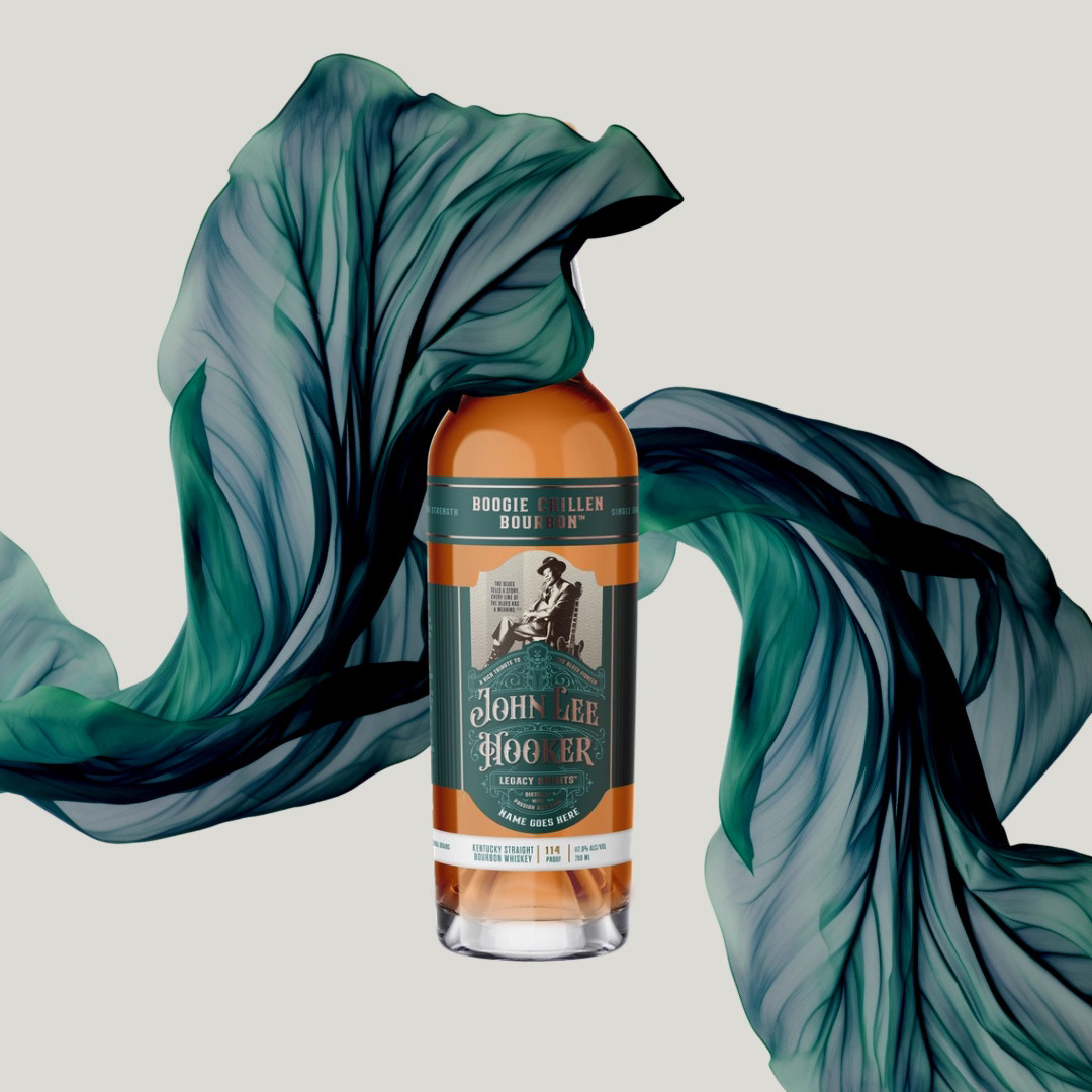
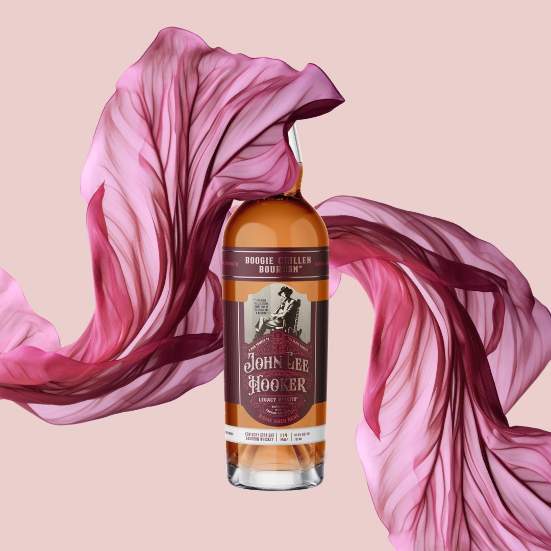
In crafting the label design for John Lee Hooker's Bourbon - Blues Before Sunrise, I focused on capturing the essence of the blues legend's music and the rich character of the bourbon itself. Taking inspiration from the original royal blue label, I transformed it into a moody black rendition, evoking a sense of depth and mystery that resonates with the soulful tones of the song. This new distinct look sets the stage for an immersive experience with every sip. Furthermore, to expand the brand's versatility and anticipation for future releases, I developed variations in burgundy and teal, ensuring a cohesive yet dynamic visual identity across the range of John Lee Hooker's Bourbon offerings.
Role: Packaging Designer | Agency: High-Proof Creative | Client: John lee hooker legacy spirits
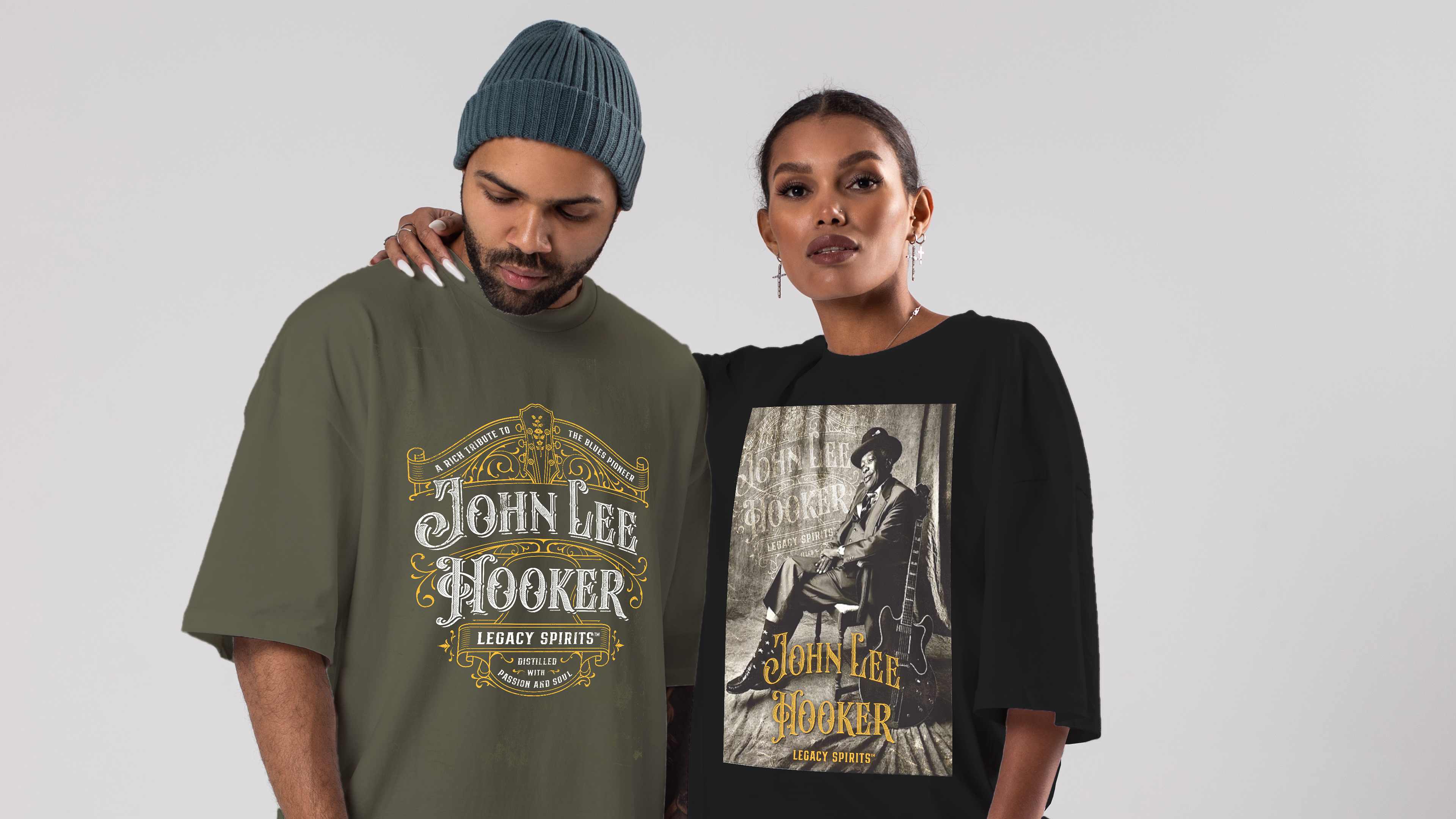
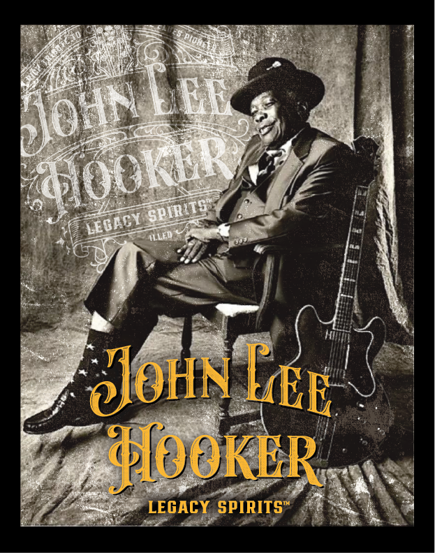
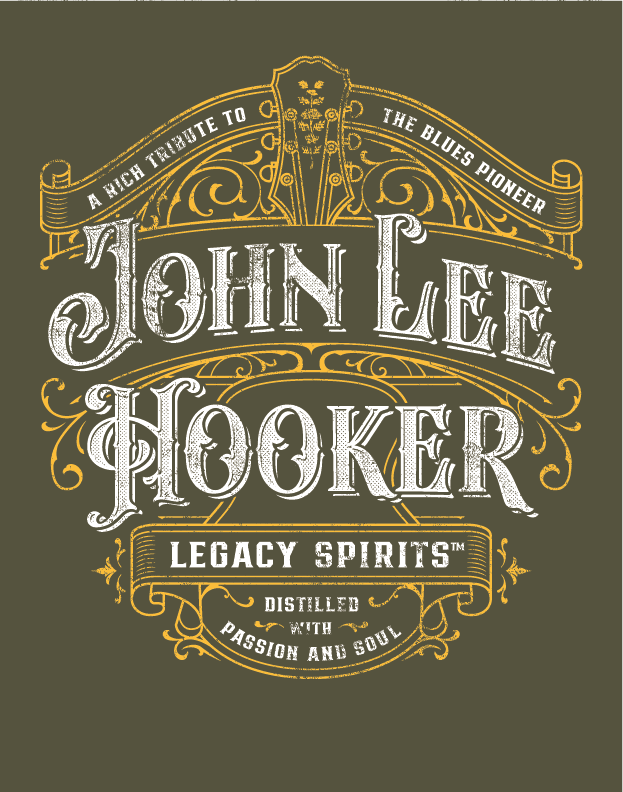
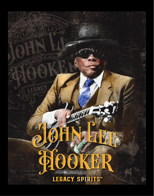
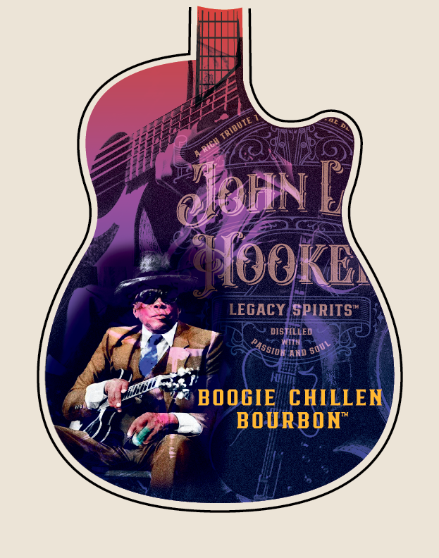
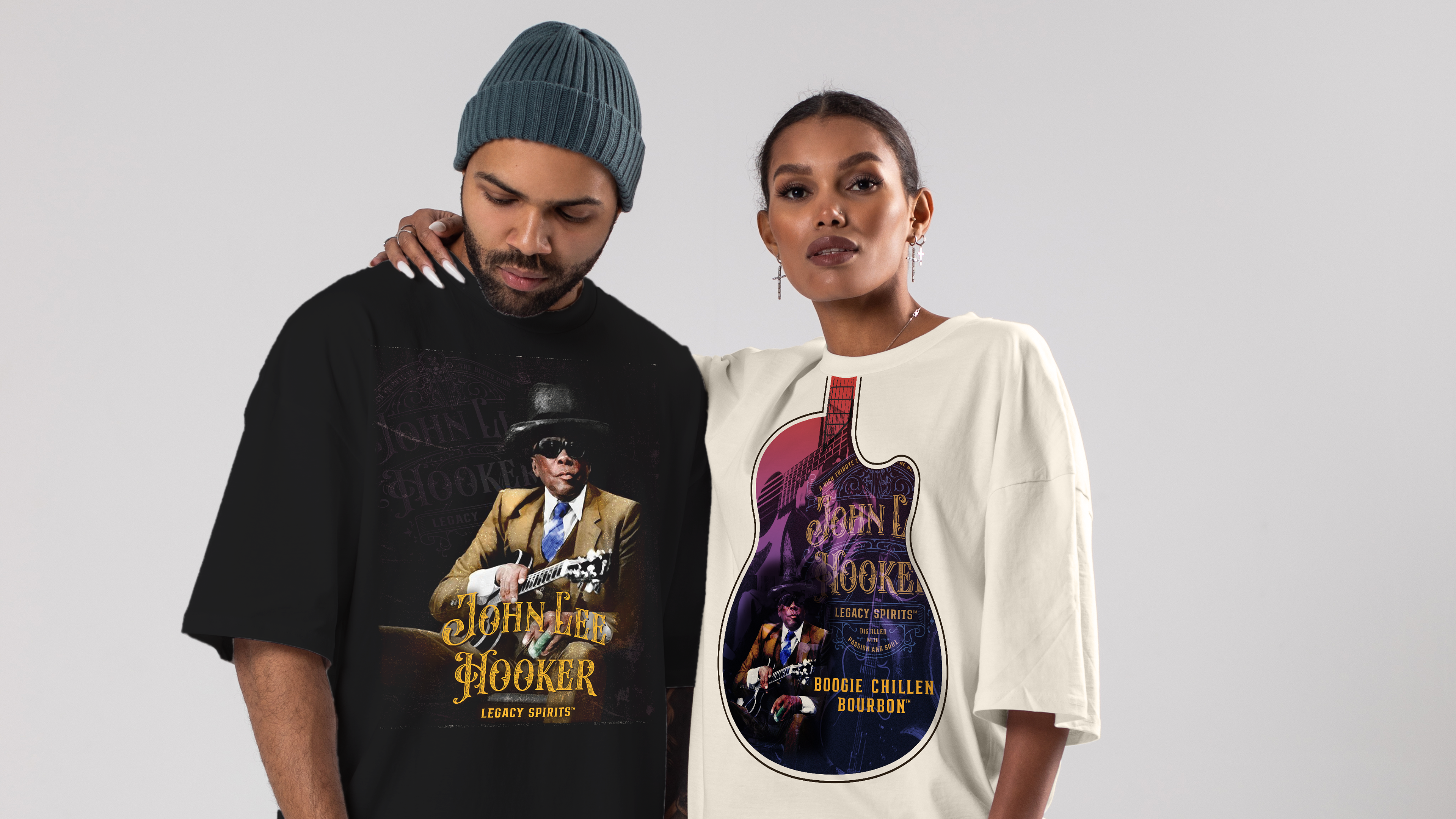
As the JLH brand continues to grow, the addition of merchandise was an exciting platform to express the legacy and the award winning logo badge High-Proof Creative crafted for them. I used historic family photos of the blues legend himself mixed with the signature logo badge and a grunge texture to lean into the history and lasting impression John Lee Hooker has.
Side Hustle Brews & Spirits, a long time client of High-Proof Creative, was expanding their whiskey line just in time for the launch of their new bar. They wanted to retain the elements of the previous version, but elevate it. My approach was to create space and subtle patterns in order to create a clear focal point and visual hierarchy that was more delicate than before. Additionally, with the change of the bottle style the layout and size needed adjustment. There are 7 versions of the label with the ability to create more using a deep jewel toned color palette.
When I partnered with As Above So Below, the challenge was to transform a boutique distillery into a fully realized brand universe. Over two years, I designed the entire tarot-inspired label collection, established a scalable packaging hierarchy system, and created award-winning spirits packaging that positioned AASB as one of the most distinctive craft distilleries in the Southwest Region.
Rooted in the heart of the Rocky Mountains, Montanya Rum Distillery is far from the stereotypical island rum brand. Their spirits are as bold and elevated as their altitude — distilled with mountain water, sustainable practices, and a deep respect for craft. I’ve had the pleasure of translating that ethos into a cohesive suite of visual touchpoints spanning in-store displays, event activations, and digital campaigns. Every project balances the rugged authenticity of the brand with a polished, modern sensibility that connects with both bartenders and consumers alike.
Back to Top