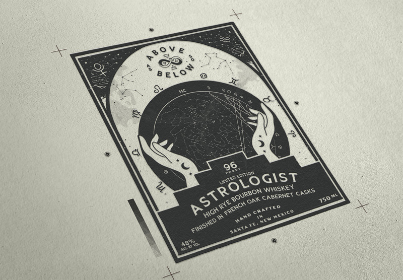
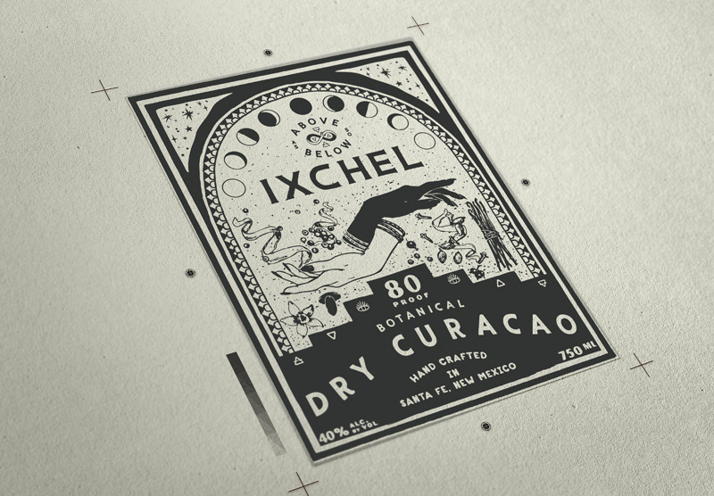
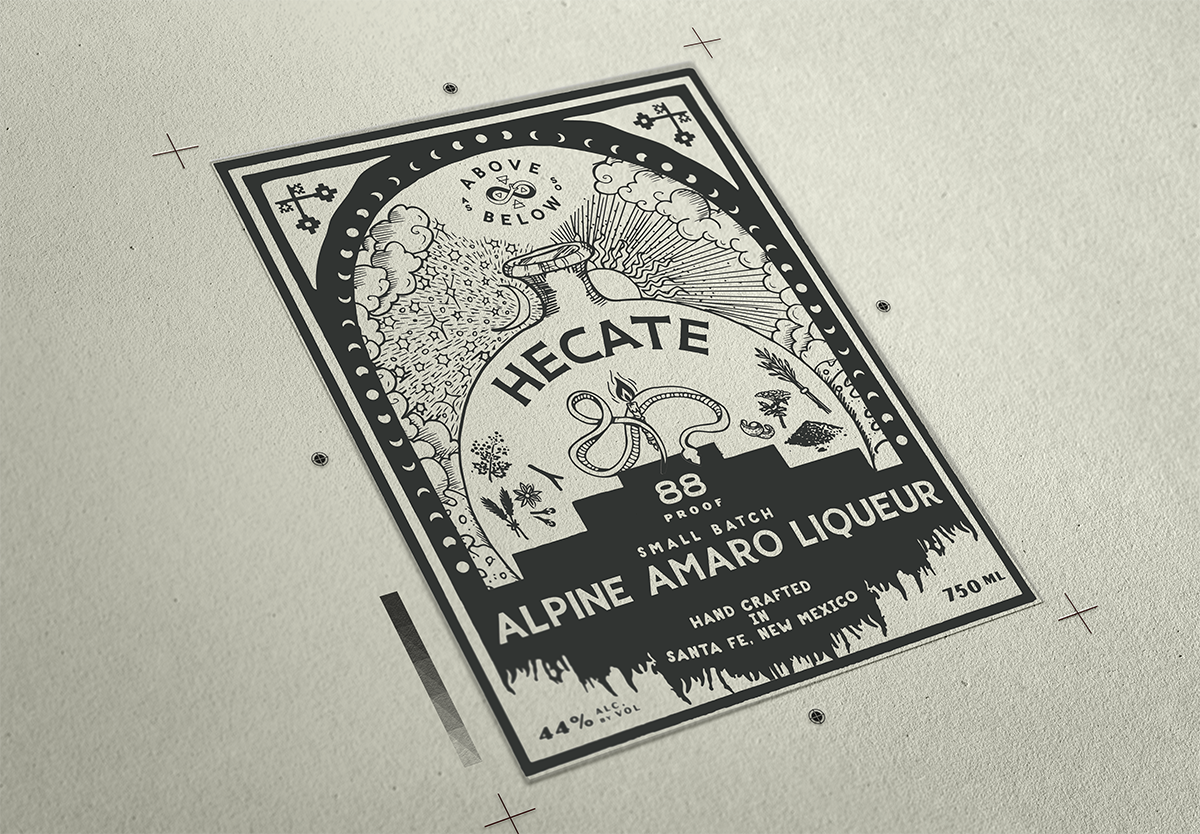
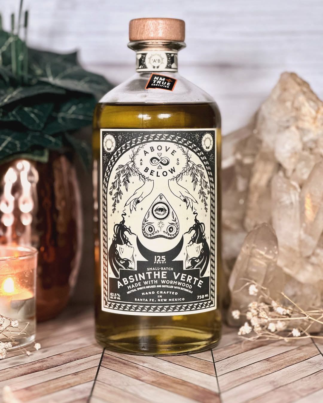
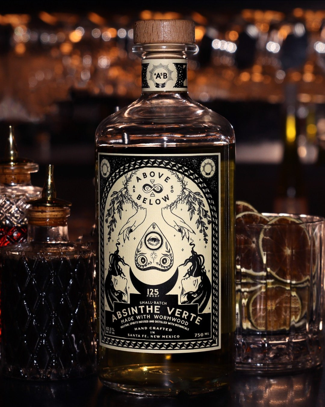
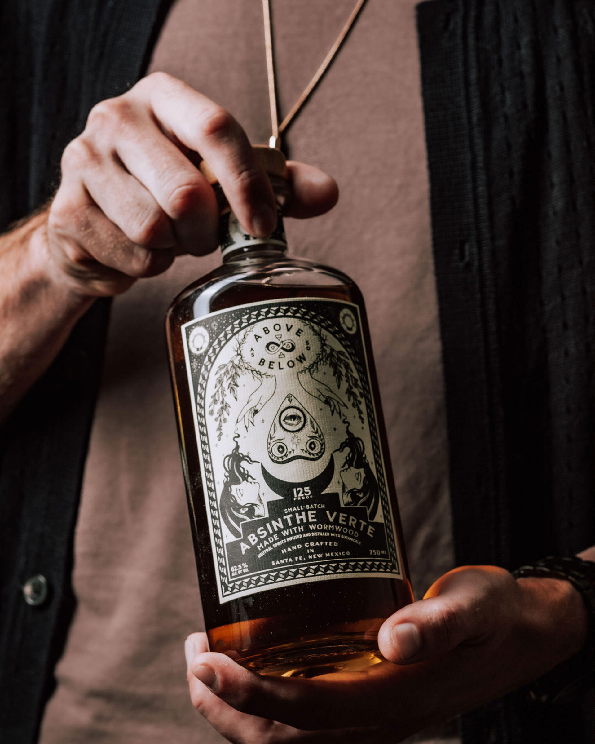
Tarot Label System
At the heart of AASB’s identity is the Tarot Series — a complete system of labels inspired by the symbolism and mystique of tarot cards. I've designed every card in the series, ensuring each release carries its own story while remaining cohesive within the broader family. This collection created a powerful narrative thread that turns every bottle into a collectible piece of art, resonating deeply with consumers and collectors alike.
Role: Brand System Development, Label Illustration, Packaging Design
Agency: High Proof Creative | Client: As Above So Below Distillery
Agency: High Proof Creative | Client: As Above So Below Distillery
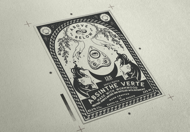
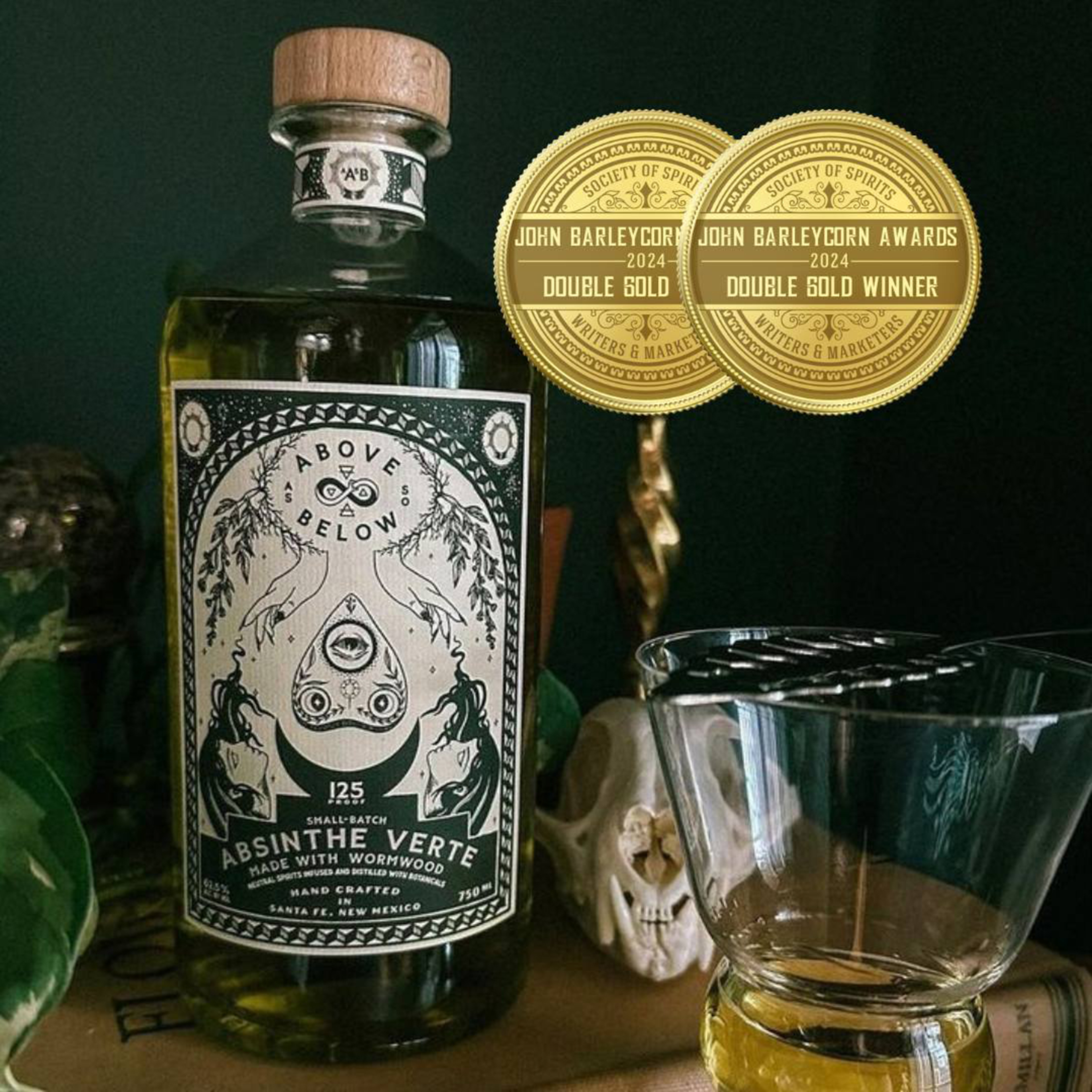
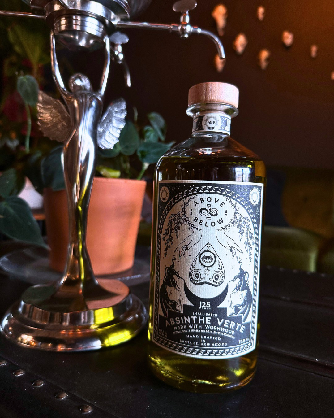
Absinthe Verte — Award-Winning Design
The Absinthe Verte release became a flagship achievement for AASB — and for me personally. With its elegant detailing and bold hierarchy, the label captured the spirit’s heritage while adding modern sophistication. This design was honored with a Double Gold at the John Barleycorn Awards, cementing AASB’s place among elite craft distilleries and showcasing my ability to merge storytelling with premium packaging design.
Role: Packaging Design, Brand Strategy Alignment
Recognition: Double Gold, John Barleycorn Awards
Recognition: Double Gold, John Barleycorn Awards
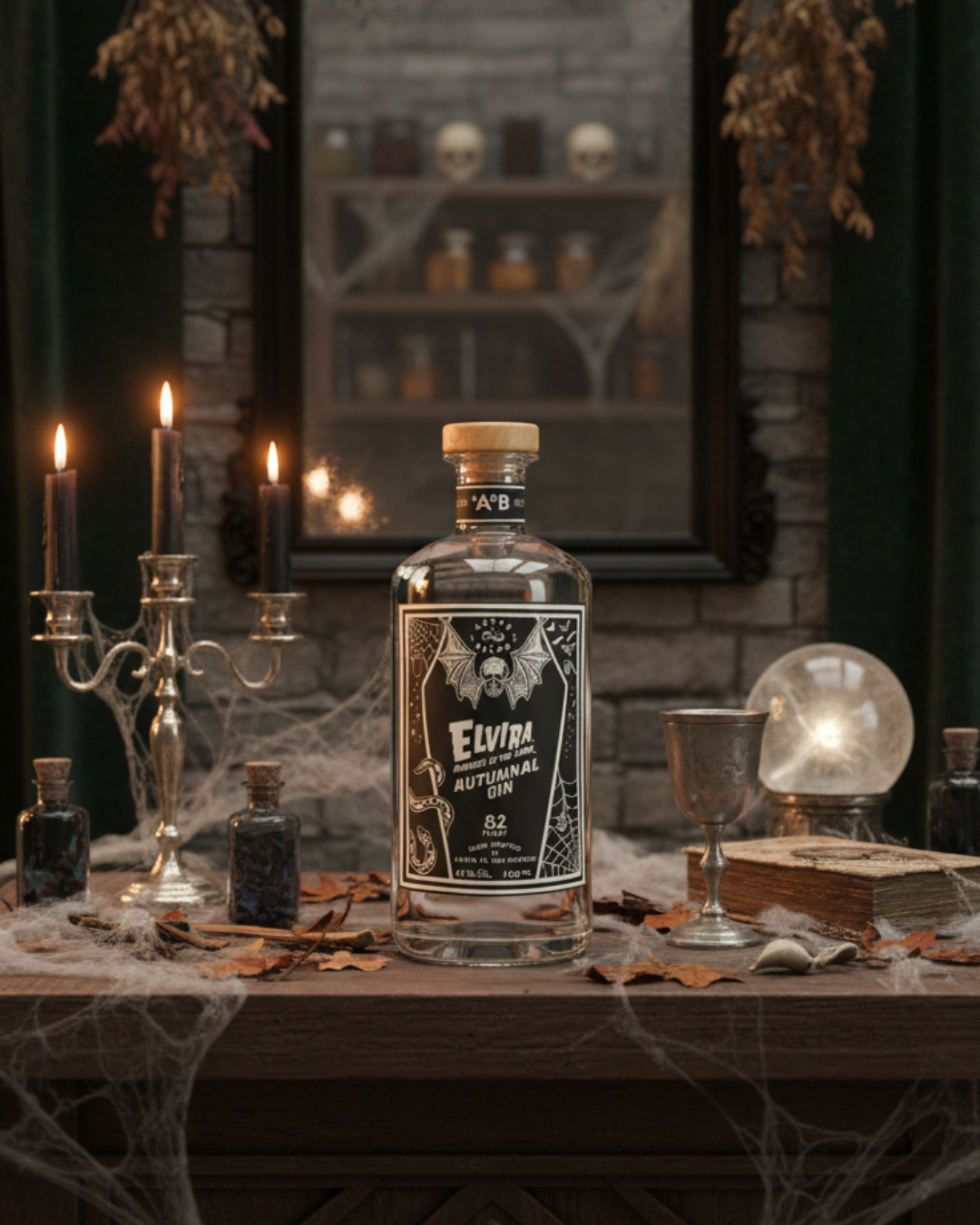
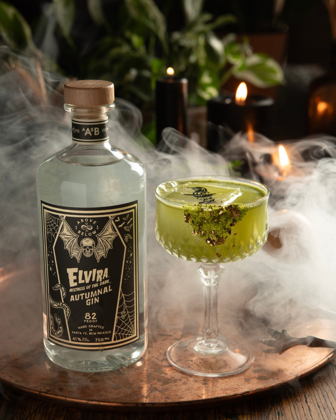
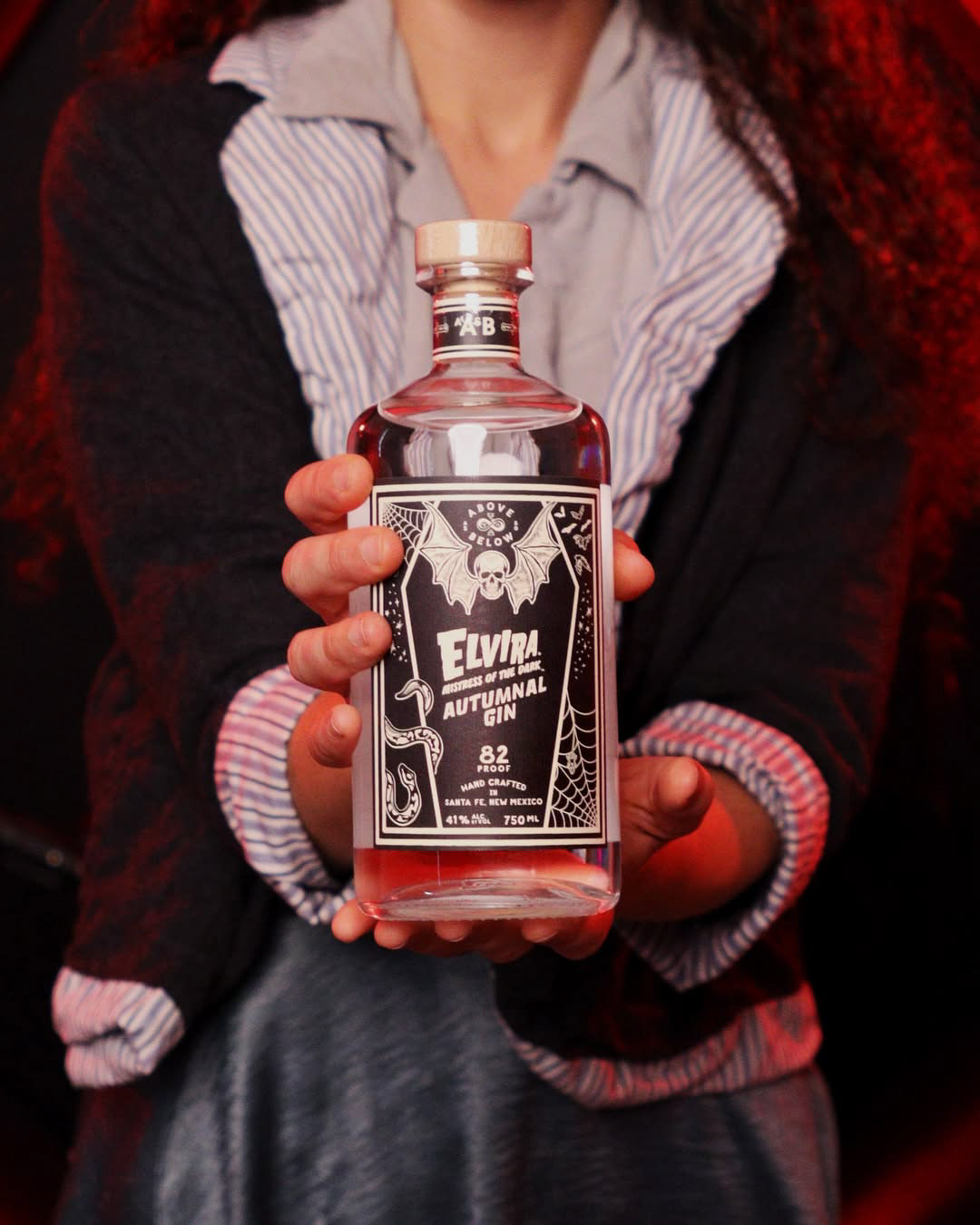
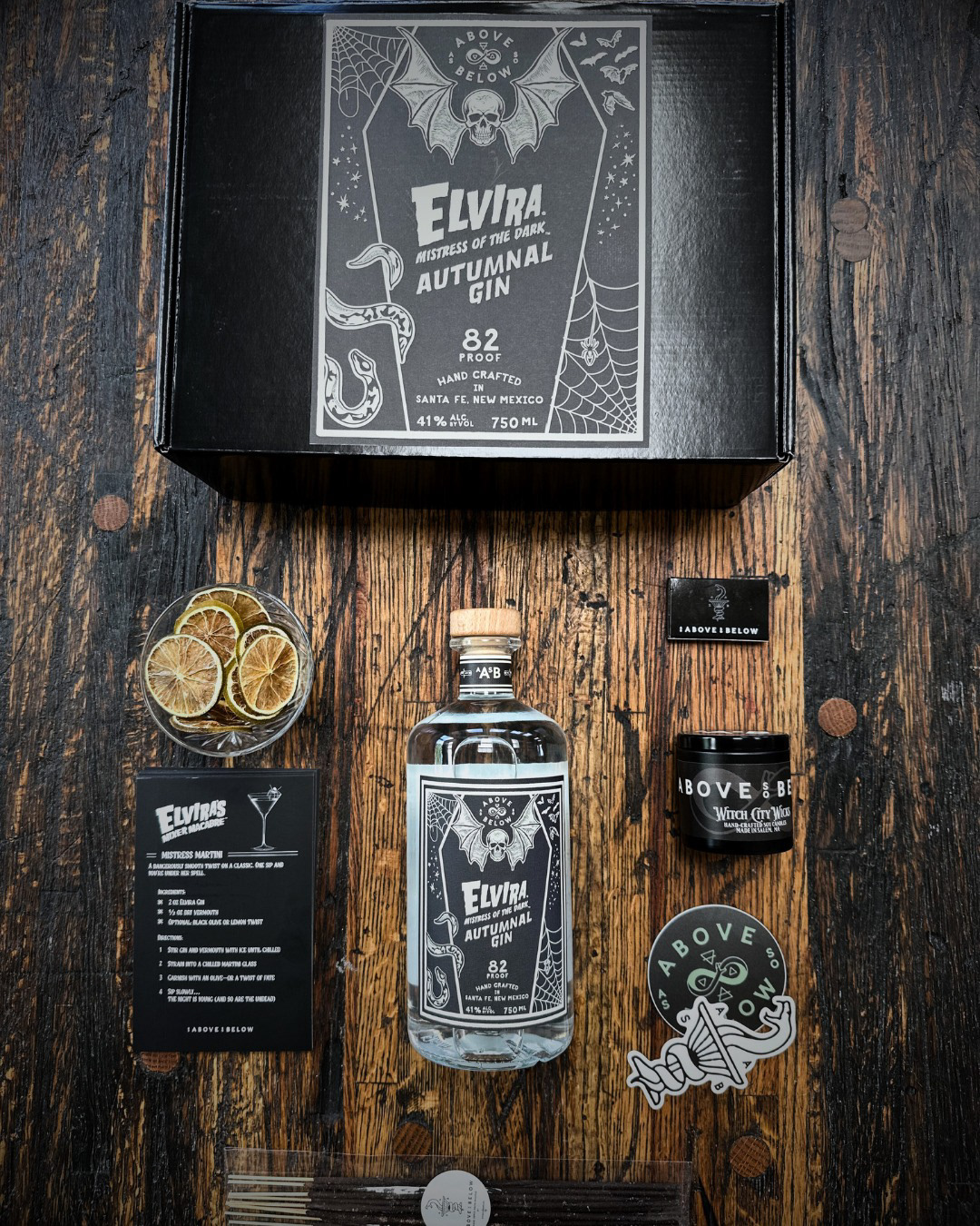
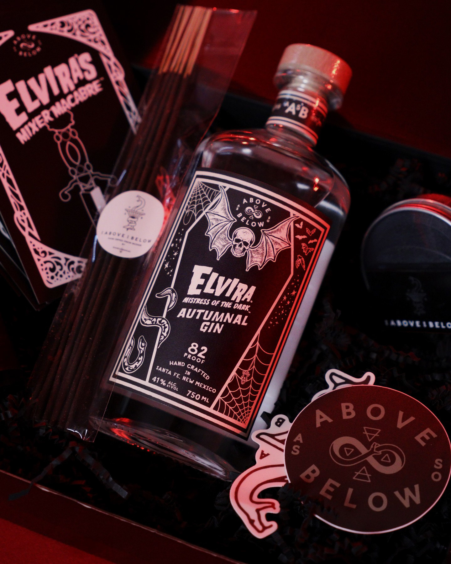
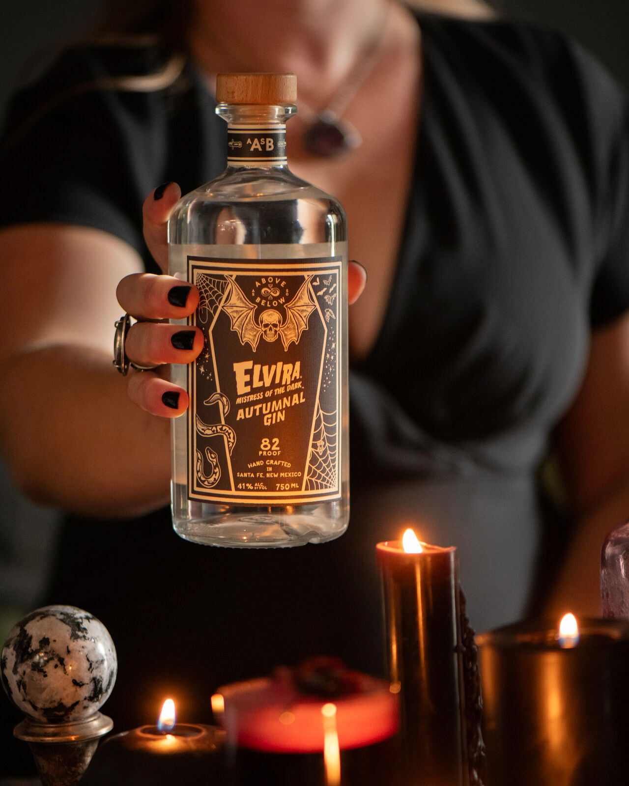
Elvira Gin (Limited Edition)
For a special release, AASB partnered with cultural icon Elvira, Mistress of the Dark. I designed the packaging for this limited-edition gin, blending gothic theatricality with premium spirits branding. The result was a bottle that not only celebrated Elvira’s persona, but also felt authentically AASB — balancing playful, dark aesthetics with refined execution.
Role: Packaging Design, Limited Edition Branding
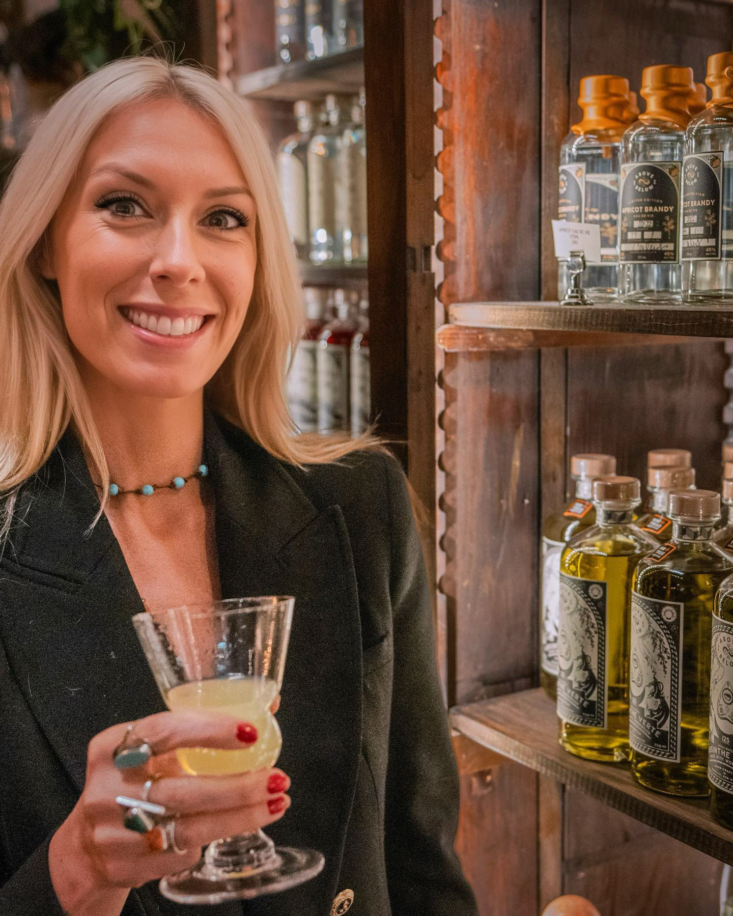
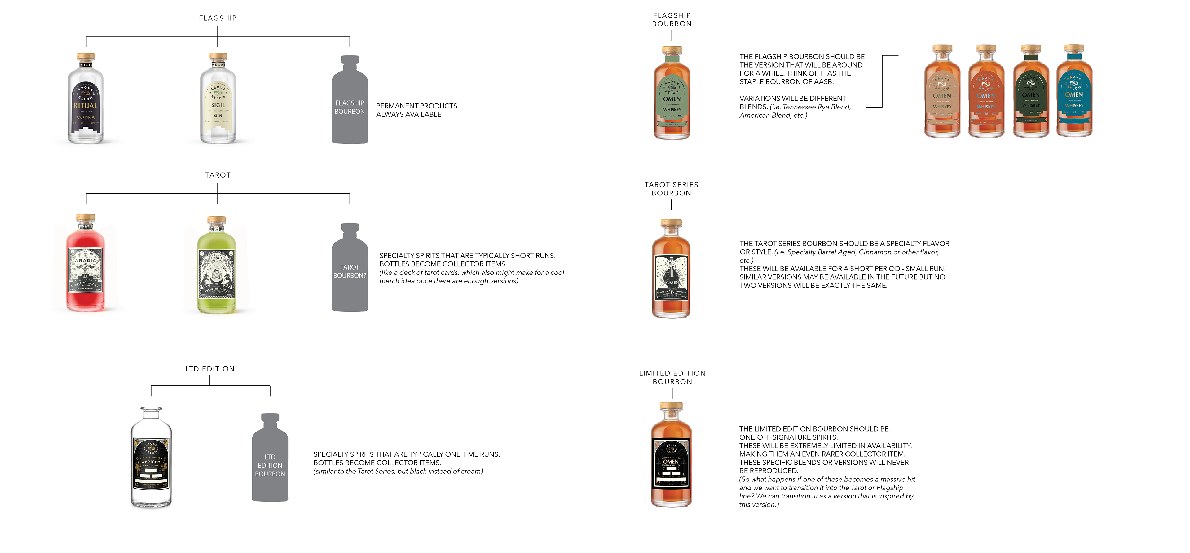
Hierarchy & Brand Architecture
Beyond individual labels, I developed the entire packaging hierarchy system for AASB, ensuring clarity across core releases, limited editions, and experimental spirits. This scalable design system created visual consistency while leaving room for creative expression within each product line.
Role: Brand System Development, Packaging Architecture
Awards & Recognition
Double Gold (John Barleycorn Awards) — Absinthe Verte
Cultural spotlight and critical acclaim — Elvira, Mistress of the Dark Autumnal Gin
Together, these honors reflect not only standout design, but also the ability to position a boutique distillery as both premium and culturally relevant.